
highfield dental redesign

INTRODUCTION
Highfield Dental is an established dental practice in Orpington, serving the local community for over 80 years. Its existing website contained extensive information about the practice and its treatments, but I identified opportunities to improve how this information was organised and presented.
I independently redesigned the website in Figma, focusing on clearer navigation, accessible content and a more modern, welcoming experience that reflects the practice's reputation.
TIME-FRAME
3 weeks
ROLE
UI/UX & Web Designer
tools
Figma
Challenge
The main challenge was making a large amount of dental information easier to navigate without overwhelming visitors. Patients needed to be able to understand available treatments, learn about the practice and find relevant contact information without searching through lengthy pages.
The redesign also needed to balance a professional, trustworthy appearance with a friendly and reassuring experience for patients.
UX DECISIONS
Restructuring treatment information
Organised treatments into General, Cosmetic and Restorative categories, with individual descriptions to help visitors understand their options.
Building patient trust
Introduced clearer team profiles, patient testimonials, practice history and facilities information to communicate the clinic's experience and approach to care.
Improving navigation and user journeys
Simplified the main navigation and introduced prominent calls to action, making it easier to explore treatments, contact the practice and enquire about appointments.
Creating a consistent visual experience
Developed a burgundy and green colour palette with consistent typography, reusable cards and buttons to establish a recognisable design across all pages.
DESIGN PROCESS
RESEARCH
The research phase focused on understanding how modern dental websites communicate trust, reassurance and treatment information in a clear and accessible way. Existing healthcare and dental websites were analysed to identify usability patterns, content structures and visual approaches that improve readability, accessibility and confidence throughout the patient journey.
ux Audit
A UX audit was conducted to identify usability, readability and navigation issues across key pages of the existing website. The analysis highlighted areas where content structure, hierarchy and user flow could be improved, helping inform the redesign decisions throughout the project.
Competitor analysis

Bupa Dental Care
Clear navigation structure and concise service summaries help users quickly identify treatments and understand the next steps in their journey. Strong use of whitespace, hierarchy and trust-focused messaging creates a more approachable healthcare experience.

Pro Dental
The website uses clear treatment categorisation, concise content sections and strong calls-to-action to help users navigate services more efficiently. The clean layouts, use of whitespace and prominent trust signals create a more modern and approachable experience while improving readability and reducing visual clutter.

London City Smiles
The website uses modern visuals, structured content sections and strong calls-to-action to create a premium yet easy-to-navigate experience. Treatment information is broken into digestible sections, reducing cognitive overload and improving scanability.

ODL Dental Clinic
Minimal layouts, calming visual design and simplified user journeys help create a reassuring experience for potentially anxious patients. The website balances informative content with visual breathing space, improving readability and overall usability.
HOW RESEARCH INFORMED DECISIONS
The competitor research highlighted common UX patterns used across modern dental and healthcare websites to improve trust, readability and patient confidence.
These insights informed the structure and design decisions within the redesign.
-
Users often visit dental websites looking for reassurance, treatment information and clear booking pathways. This influenced the decision to simplify navigation and prioritise key actions.
-
Concise content sections, categorised treatments and stronger visual hierarchy improved scanability and helped users compare services more efficiently. This informed the restructuring of treatment information into clearer, more digestible sections.
-
Trust signals such as patient reviews, clinician experience and reassurance messaging were integrated throughout the user journey rather than isolated on separate pages. This influenced the placement of testimonials and trust-focused content across the redesign.
-
Clean layouts, whitespace and blue colour palettes were commonly used to create a calmer and more trustworthy healthcare experience. This informed the visual direction and overall page structure.
-
Icons and imagery were frequently used to support treatment categories, helping users identify services more quickly and improving scanability. This influenced the use of more visual treatment navigation.
-
Mobile-friendly layouts prioritised shorter sections and simplified scrolling experiences. This influenced the responsive structure and clearer mobile hierarchy used within the redesign.
INFORMATION ARCHITECTURE
The sitemap was created to simplify navigation and create clearer pathways to treatments, trust-building content and booking actions. Related information was grouped into broader categories to improve discoverability and reduce unnecessary navigation complexity.
-
The homepage was structured to prioritise reassurance, treatment visibility and key actions early within the user journey.
-
Supporting pages were organised into more focused and digestible sections to improve readability and navigation.
-
Treatment information was categorised into General, Cosmetic and Restorative sections to help users compare services more easily.
-
Trust-building content such as clinician information, clinic imagery, testimonials and before & after results was integrated throughout the structure to create a more reassuring and user-friendly experience.
-
Contact information and appointment booking were consolidated into a single clear destination to support a more straightforward booking journey.

Wireframing
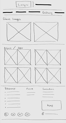
Building on my research and website audit, I developed low-fidelity wireframes to explore a clearer structure for Highfield Dental's website. Rather than focusing on visual styling, I prioritised how information would be organised, how users would move between pages and where key actions should appear.


Simplifying the User Journey
My review of the existing website highlighted opportunities to improve how visitors access key information, particularly treatment options, practice details and appointment enquiries.
To address this, I organised the navigation into five clearly defined pages: Home, About, Treatments, Gallery and Contact. I also structured the homepage to introduce the practice, highlight its credibility and present popular treatments, with prominent calls to action directing visitors towards relevant information.
These decisions aimed to create clearer pathways through the website, reducing unnecessary navigation and helping visitors find information based on their needs.

Prioritising Trust and Accessibility
As choosing a dental practice involves both practical and personal considerations, I gave greater prominence to credibility-building elements such as patient testimonials, dentist profiles and the practice's history.
I also considered accessibility through logical heading structures, consistent navigation, clearly labelled sections and prominent calls to action. These decisions established the foundation for the subsequent visual design.
Prototyping
The wireframes were refined into mid-fidelity prototypes, allowing the layouts and user journeys to be explored in greater detail. During this stage, several design decisions were revisited and iterated upon to improve content hierarchy, navigation and the overall user experience before progressing to the final visual designs.


Restructuring Information
The original website contained lengthy text sections, particularly across its practice information and treatment pages, making individual topics less distinct.
In my prototypes, I developed the About page into dedicated sections for the team, practice history, values and facilities. I also refined the Treatments page by separating the three-category overview from individual treatment descriptions, allowing visitors to scan available services before exploring them in greater detail.


Refining Page Layouts
While the wireframes established the overall page structures, the mid-fidelity prototypes allowed me to explore more detailed content arrangements.
I developed treatment cards and testimonial sections on the homepage, introduced a structured image grid for the Gallery, and separated contact details, consultation enquiries and urgent dental information on the Contact page. These page-specific layouts helped establish clearer visual distinctions between different types of information while maintaining consistency across the website.
Final Design
I developed the high-fidelity prototypes in Figma, bringing together the research, wireframes and refined layouts into a complete website redesign. My focus was on creating a consistent, accessible and welcoming interface that reflected Highfield Dental's existing identity while addressing the usability issues identified during my research.


Key Design decisionS
-
Treatment information architecture: Organised services into General, Cosmetic and Restorative categories, with individual treatment descriptions to help users find and understand relevant options.
-
Trust-building content: Integrated dentist profiles, patient testimonials, practice history and facilities information to communicate the clinic’s experience and approach to care.
-
Consistent visual system: Applied a burgundy and green colour palette, consistent typography, reusable cards and button styles across the website.
-
Appointment and contact journeys: Added prominent booking calls to action and brought contact details, the consultation form and urgent dental care information together on the contact page.
Final Design Considerations
-
Brand continuity: Retained Highfield Dental's original burgundy colour, introducing complementary green accents to modernise the visual identity while maintaining a connection to the established brand.
-
UI consistency: Applied consistent typography, button styles, treatment cards and content containers across all five pages, establishing recognisable patterns throughout the interface.
-
Inclusive navigation: Used familiar navigation conventions, descriptive labels and clearly identifiable actions to accommodate visitors with varying levels of digital literacy.
-
Accessibility and readability: Prioritised clear typography, contrasting colours, manageable text blocks and consistent spacing to support readability for patients of different ages and abilities. Formal contrast checks and assistive technology testing would be needed to verify accessibility.
Project reflection
Project Outcome
This project allowed me to take an existing website through a complete UX redesign process, from identifying usability issues and researching comparable practices to developing wireframes and a high-fidelity prototype in Figma.
The outcome is a five-page website concept that brings together a more structured approach to presenting dental information, a consistent interface and clearer routes to key patient services.
Working Independently & Managing Limitations
As an independent redesign, I worked with publicly available information and imagery from Highfield Dental's existing website. Where suitable photographs weren't available, I used AI-generated images to support the proposed visual direction.
I also contacted the practice to share my redesign, offer my web design services and invite feedback. Although I haven't received a response, I continued developing the concept using my research findings and design judgement.
Next Steps
If developed further, my priorities would be to conduct usability testing with prospective patients, gather stakeholder feedback and assess accessibility, particularly colour contrast, keyboard navigation and compatibility with assistive technologies.