
Studioloku PROJECT

INTRODUCTION
Studioloku is a post-production business that needed a clear and professional online presence to showcase its services and attract clients.
As a new business with no established website, it was important that users could quickly understand what was being offered and feel confident in the brand.
I designed a responsive website focused on clarity, structure and ease of navigation, ensuring users could easily explore services, view work and move towards making an enquiry.
Challenge
Studioloku is a post-production business that needed a clear and professional online presence to showcase its services and attract clients. As a new business with no established website, it was important that users could quickly understand what was being offered and feel confident in the brand.
I designed a responsive website focused on clarity, structure and ease of navigation, ensuring users could easily explore services, view work and move towards making an enquiry.
TIME-FRAME
3 weeks
ROLE
UI/UX & Web Designer
tools
Figma (Prototyping), Wix (Web design), Discord (Client Communication)
Scan for Mobile version:

CONSTRAINTS
To meet the tight deadline, the UX workflow was condensed to focus on the most essential stages — research, wireframing, prototyping, and user testing before moving straight into high-fidelity design. This ensured the website was delivered on time while still supporting clear, user-focused functionality.
UX DECISIONs
Simplifying the site structure
I kept the overall layout minimal and intuitive so users could quickly understand the business and move easily between key sections without confusion.
Prioritising service clarity
Services were broken down into clear, digestible sections to help users quickly understand what was being offered without needing to read large amounts of text.
Designing for quick navigation
A clean navigation system and logical page flow were used to help users find information quickly and move through the site with ease.
Strengthening trust through layout and visuals
The visual design was kept clean and consistent to create a professional feel, helping establish credibility for a new business.
STUDIOLOKU DESIGN PROCESS
RESEARCH
The research phase combined in-depth conversations with the client to define their goals, services, and visual expectations, along with industry research to understand how post-production services are typically presented and what helps users quickly understand and trust a service.
Competitor analysis

Clear and structured service presentation makes it easy to quickly understand what is offered.

Prioritises showcasing video work upfront, allowing users to quickly assess quality and build trust before exploring services.

Strong visual identity and high-quality visuals help establish credibility and a premium feel.

Balanced use of text and visuals helps communicate services without overwhelming the user.
HOW RESEARCH INFORMED DECISIONS
The research highlighted how users typically engage with post-production websites and what helps them quickly understand and trust a service. These insights directly informed the design decisions:
-
Users want to quickly understand what services are offered. This led to structuring the services into clear sections with concise descriptions, making it easy to scan and understand the offer at a glance.
-
Creative service websites rely heavily on strong visual presentation to build trust. This influenced the use of a clean, minimal layout with high contrast and strong visual hierarchy to create a more professional and credible feel.
-
Users often look for examples of work before committing to a service. This informed the decision to make portfolio content easy to access and visually prominent within the site.
-
Simple navigation improves how quickly users can move through the site. This led to a minimal navigation structure and clear page flow, helping users find key information without unnecessary steps.
INFORMATION ARCHITECTURE
Based on the research, I created a clear and simple site structure to help users quickly understand the business and move between key pages such as Services, Portfolio, and Contact to guide users towards making an enquiry.

WIREFRAMING
I created wireframes to define the layout and structure of each page before moving into visual design. This helped focus on content hierarchy, navigation and overall usability without being influenced by visual styling.
KEY LAYOUT DECISIONS
-
The homepage was structured to quickly communicate the services being offered, with a clear introduction followed by key services and visual content to help users understand the business within the first few seconds.
-
Each service was separated into distinct sections with concise descriptions, making it easy for users to decide on which package is appropriate for their needs without reading large blocks of text.
-
Portfolio elements were positioned prominently to allow users to quickly assess the quality of work, supporting trust before they explore further or make an enquiry.
-
A minimal and consistent navigation structure was used across all pages, ensuring users could easily move between Home, Services, Portfolio, and Contact.
-
Contact points were considered early in the layout, ensuring users always had a clear and accessible route to make an enquiry once they felt ready.
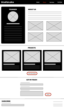
HOMEPAGE

ABOUT

SERVICES

Portfolio

Prototyping
The client was happy with the wireframes so I swiftly moved on to making low-fidelity prototypes that could be used to test how users would navigate through the site and interact with the layout. The following prototypes show the refined layouts developed after iterating on initial ideas and incorporating client feedback. This iterative process helped ensure the final designs were both intuitive for users and aligned with business goals.
HOMEPAGE

ABOUT
confirmATION

SERVICES

Portfolio

testing
Testing was an essential step in refining the overall user experience before the final build.
It helped identify usability issues, confirm that interactions felt intuitive, and ensure the navigation flowed naturally across the site. By gathering feedback at this stage, adjustments could be made early, allowing the final design to feel more polished, functional, and aligned with user expectations.
What was tested
Testing focused on how users interacted with the structure and key journeys across the site.
Examples of prompts given to users:
-
"You’re interested in StudioLoku but aren’t sure what they offer. Find out what services they provide."
-
“You want to see examples of StudioLoku's work before making a decision. Where would you find this information?"
-
"You’ve decided you may want to work with StudioLoku. How would you get in touch to discuss your project?"
KEY FINDINGS
-
Users were able to navigate between pages and understand the overall structure without confusion, indicating that the layout and page flow were intuitive.
-
Breaking services into smaller, clearly defined sections helped users quickly understand what was being offered without needing to read large amounts of text.
-
Some users were unsure how to quickly access contact options, suggesting that the pathway to enquiry needed to be more visible and direct.
-
Secondary elements such as social links were often overlooked, indicating that their placement and visibility could be improved.
Design improvements
-
Introduced a clearer and more accessible contact pathway, making it easier for users to find how to make an enquiry.
-
Strengthened the placement and visibility of key call-to-action elements to better guide users towards the next step.
-
Refined spacing and layout across pages to improve readability, clarity, and overall visual flow.
-
Repositioned secondary elements such as social links to make them easier to notice and access.
FINAL BUILD
After refining the design through testing and iteration, I built the final website using Wix, translating the validated layouts and structure into a fully responsive live site.
The build focused on maintaining the clarity, hierarchy and navigation established in earlier stages, ensuring the final product reflected the intended user experience.
IMPLEMENTATION CONSIDERATIONS
-
Ensured the layout and spacing remained consistent across different screen sizes to support a responsive experience.
-
Maintained clear visual hierarchy to guide users through key content and actions.
-
Optimised navigation to remain simple and consistent across all pages.
-
Ensured key actions such as contacting were always easily accessible.
ACCESSIBILITY CONSIDERATIONS
Accessibility was considered throughout the design and build process to ensure the site was usable for a wide range of users.
-
Clear visual hierarchy and spacing were used to improve readability and help users easily scan content.
-
Text was kept concise and structured to reduce cognitive load.
-
Navigation was designed to be simple and consistent, supporting ease of use across the site.
-
Colour contrast and layout choices were considered to ensure content remained clear and legible for users with different visual needs, including colour vision deficiencies.
These decisions helped create a more inclusive and user-friendly experience.
Final template
